
Gaming Grimoire
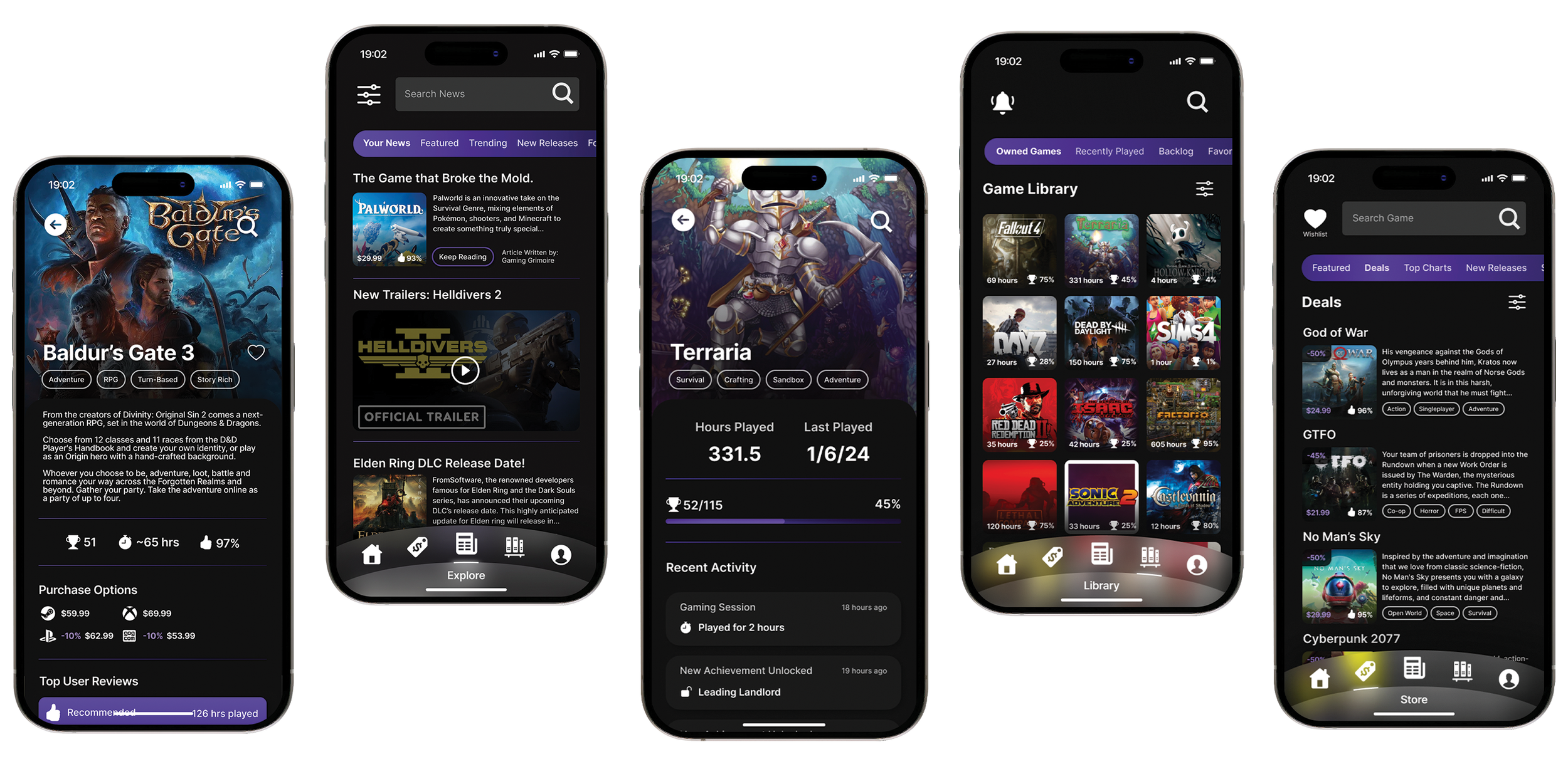
Track games, achievements, playtime, compare prices, get guides, and stay updated with news, all in one app.
App Idea
Comprehensive tracking: Develop a platform that allows users to link their accounts to automatically track their games with no manual input required
A single platform solution: Minimize the need for users to switch between multiple apps for each platform or functionalities
Insights: An intuitive way to track game progress tracking and preference analysis with clear, user-friendly graphs and charts.
Utility: A multi-faceted app that’s more than a game catalog; main ideas include: a store with price comparison, personalized recommendations, hub for recent gaming news from both corporate and indie creators, and user created game guides.
Objectives
Team Size
A tight-knit team of four
Role
Researcher, Lead UI Designer
Approach
Goal-Directed Design
Duration
12 weeks (February - April 2024)
Tools
FigJam, Figma, Photoshop
Introduction
Our app is designed for dedicated gamers. For our audience, each game holds memories, challenges, and triumphs. But as their collection grows, so does the complexity of keeping track of it all. We set out to create a solution: a digital companion designed by gamers, for gamers.
Connect your favorite game platforms (Steam, PlayStation, Xbox, etc) and Gaming Grimoire will do the rest, automatically filling your in-app game library. From there, you can sort, filter, or create categories to fit your needs.
Other features include: a store that will show you the best deal on each platform, a hub for gaming related news, a profile page with detailed playing statistics displayed through charts and graphs, and helpful game guides and information about the games you love.
For this class project, we were tasked to pitch and design an app over the course of 12 weeks. Our team—comprising of a leader, researchers, and designers—leveraged tools like FigJam, Figma, and Photoshop to bring the app idea to life.
Our approach to designing Gaming Grimoire was rooted in the Goal-Directed Design (GDD) method. This process page serves as a roadmap to GDD principles and illustrates its application in the development of Gaming Grimoire.
The Team

Cole Andrews
Leader, Researcher, Designer

Max Ray
Researcher, Lead Designer

Alison Christen
Researcher, Designer

CJ Brown
Researcher, Designer
Goal-Directed Design
Our approach to designing Gaming Grimoire was rooted in the Goal-Directed Design (GDD) method. GDD was founded by Alan Cooper whose book, About Face, critiques the failures of current design methods at the time as they often neglect the user's needs in favor of company interests. Understanding a user's individual goals, needs, and motivations is stressed to be the cornerstone of product design. This process page serves as a roadmap to GDD principles and illustrates its application in the development of Gaming Grimoire.
Research
Persona Hypothesis
The first course of action was the Persona Hypothesis, which serves as the foundation for empathizing with possible users of our product. We defined the roles that our app would have, the types of people who might be interested in the app, user’s needs and goals, the ranges of behavior, and type of environments.
Literature Review
This step involved researching the product’s market. We were tasked with finding five citations to analyze in which we covered recommendation systems, how gamers learn and perceive things, the mindset behind “completionist” gamers, and console wars/why cross-platform is important. My research focused on player types, as I theorized it would help with crafting personas later down the line, since it focused on tailoring experiences while improving retention of different types of gamers.
Competitive Audit
The competitive audit helped us learn our competitors’ strengths and weaknesses, which gave us an idea for possible opportunities in our design. What value could we bring to the table?
The four competitors we chose were PlayTracker, Steam, PlayStation, and Game Log. Steam and PlayStation are more stores than game tracking apps (other than their own respective games they sell), so that’s why we also went with PlayTracker and Game Log, since it’s closer to what we were designing. Essentially, we wanted to study what gamers already trust and what gamers might want.
User Interviews
Using the information we gathered from our persona hypothesis, we wanted to interview multiple “types” of gamers. We established that gamers can be casual, competitive, achievement hunters, etc. We decided to interview a spectrum of gamers to see which role would be our target audience, and the needs of each type of user.
Due to the time constraint, we were only able to interview five people and didn’t have the opportunity to properly screen them. This proved to be an obstacle for us later on because some of the information was not as conducive as we were hoping it would be.
We hosted one of the interviews in person, and the other four over Microsoft Teams. Every member of the group had their chance to be the lead interviewer, while the other members took notes.
Affinity Maps


During the interview, the facilitators would take notes from the interviewee’s responses to the moderator’s questions. After the interview, our team would create an Affinity Map which is a brainstorming method used to organize and categorize ideas during and after discussions. We would individually create sticky notes of what we found important, and then group them into different categories. These highlight different patterns of traits the interviewee showed by finding common trends and themes from the observed answers and behaviors. This information helped us in next phase, modeling, as the clusters we formed were able to help us identify user behavioral variables.
Interviewee #2
Interviewee #1
Modeling
Behavioral Variables
After the research phase was completed, we had a lot of information about our potential users. The first step we took in this process was identifying behavioral variables. We were able to find and create visual continuums for 16 behavioral variables.
With the constraint of only having five interviewees to study, it was somewhat difficult to establish connections between them. However, we did notice two trends that were often on opposite ends of the spectrum. This polarization of responses encouraged us to create two personas for our app; our primary was directed towards the more “intense” gamer, while the secondary targeted the more “relaxed” gamer.
Personas
A persona is a fictional character that represents the typical user of a product based on research data. Personas help design teams empathize with their target audience which ensures that solutions are user-centered. After establishing the behavioral variables, we knew that we required a primary and secondary persona. We started by describing some characteristics and goals of each persona, which then was used in the process of writing the actual persona narrative.
Our primary persona is Melvin. He’s a game design student/intern and has a limited amount of time for gaming due to his busy schedule. Due to this, he’s seeking a more efficient way to choose games, manage his backlog, view information about the games he plays, and keep up to date with new gaming related content.
Our secondary persona is Kennedy. She’s a copywriter who enjoys escaping into immersive worlds in her free time. Not driven by competitiveness or achievements, Kennedy views gaming as a means of relaxation and enjoyment. She uses Steam’s wishlist feature to scope out the best deal, and she wishes for better organization of her owned games.
The big difference between the two is why they game. For Melvin, it’s a passion but a hard one to keep track of sometimes. For Kennedy, it’s simply relaxing or a way to bond with friends. We consider both of these types of users to be our audience, but we favored Melvin when designing our project because he seemed like he’d get more use out of it while Kennedy would install it for fun.
Requirements
Synthesizing our Data
Now that we had our personas, it was time to gather the insights from the modeling phase to figure out what exactly our app needed to do. This involves outlining the key features and functionalities that our product that would make a difference for our users, addressing their needs and goals in the best possible way. We brainstormed what the app should be, what it can do, and features to build.
Context Scenario
A context scenario is a narrative description that illustrates how a user interacts with our product in a real-world context.
We explored three topics:
1) Their motivations: what drives them to use the app?
2) Their actions: how do they navigate the app to achieve their goals?
3) Their environments: where and when in their daily lives might they find our app most useful?
This is an important step in the GDD process as it helps us design solutions that truly matter to our users, fitting right into their lives and what they value. We created a context scenario for both of our personas, Melvin and Kennedy.
Requirements List
The next step was to make a comprehensive list of specific features and functionalities that our app must meet to satisfy the user’s needs and goals. It’s essentially the blueprint for us to follow when designing the screens for the app. We needed to design for what possible actions the user might expect for our product to have. We used an action/object/context template which focuses on user intentions and makes it easy to prioritize requirements based on their importance and impact on the user’s experience.
In our list, we noted that a game library, app connections, wishlist, store, and game reviews were essential to the app’s functionality. However, features like a friends list/chat and profile customizations were nice to have in a fully functioning app but outside of the scope of this project and deemed nonessential.
Frameworks
Wireframing
The requirements list was broken down into features the app needed to have to meet the user’s goals and needs. However, we couldn’t jump straight into prototyping and designing the app, we needed a layout and structure to follow.
Using FigJam, we made lo-fi wireframes which visually represent the features we want the app to have and catch any potential issues early on before investing time and resources into each individual screen.
We categorized our wireframe flows by color, with the red flow being our Key Path which is the most significant path to our primary persona. We decided that users will typically open the app to either check their stats or look something up about a game they already own or plan to own.
The other colors depict the Validation Scenarios which are all of the other flows that may need to exist for the app to accomplish all of the requirements. We gave each of them different colors to visualize it more effectively. Each of them represent different features of our app (the store, news, game library, profile, etc).
Prototyping
After our wireframes were made, we moved onto prototyping in Figma.
I designed four concepts for possible style choices, and we chose which one seemed to fit our audience the best through a team vote and also external input (asking friends, classmates, etc). We went with a dark theme and a purple accent color because it fits the theme of “Grimoire” and magic.
We created a style guide to refer to when designing that outlined the colors and typefaces we wanted to use. Then, I went back and made sure that everything followed an 8pt grid to improve consistency in the aesthetic look of the app.
Refinement
Usability Testing
The last step was to get outside opinions on our design. We contacted two of the interviewees from the research phase and asked them to do a usability test for us to watch. We prompted them to complete certain tasks like “Find information about the game Terraria”, and then we would watch to see how they navigated our prototype.
The most notable takeaways were:
- Trouble finding wishlist
- Notification page lacked polish
- Showing too much information on one graph
- Some fonts were hard to read
- Store icon looked too similar to the Home icon
We made the following changes based on the feedback:
- Added a label under the wishlist icon
- Revamped the notification screen
- Changed the graph to 6 months instead of yearly stats
- Increased font sizes overall
- Changed store icon from market to price tag

Conclusion
Reflecting on our process, we’ve learned several valuable lessons that will aid us in the future. If given more time, we would allocate additional resources to user research. Five people is not sufficient enough for a good foundation to be made about what users want. This was exacerbated by our inability to accurately screen participants, leading to some information being an outlier from our understanding of the target audience.
For example, one of our interviewees only had a handful of games that he played, and they were all contained on one platform. His insights weren’t as significant as someone who owns multiple consoles and has a large catalog of games to track because those are the people who would find the most value in our app.
In the end, we were all glad that we created something we were proud of, and it was that sense of pride that made all of our work feel worth it. It felt like a great accomplishment to hear all of the positive feedback from our usability testers, since they were there from the initial concept to the finished product. Looking ahead, we see the value of the GDD process in Gaming Grimoire's journey, and we're excited to apply these lessons to future projects for even greater success.